Understanding the Smarkets Exchange layout
Andy Schooler
29 November 2022
There are a lot of numbers – and a few different colours – on each market page, but each is easily understood. Let’s take a look at the image below.
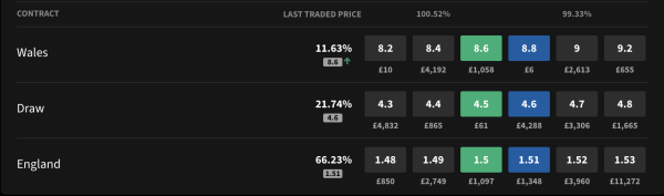
Firstly, let’s deal with the colours. The green boxes show the current odds for those looking to ‘back’ each selection – if you back a selection (Wales, Draw or England, in this example) then you are betting on that outcome happening.
In this example, you can back Wales to win the match at 8.6. To do so, you would click the green button and the selection is automatically added to your betslip.
The blue boxes show the odds available to ‘lay’ the selection. If you lay a selection, you are betting on that outcome NOT happening. Again, click the button and the bet will be added to your slip.
You will notice a monetary figure under the green and blue buttons. This shows the amount of money that you can bet to be instantly matched by a respective layer at those odds.
In this example, you can back Wales at 8.6 to the tune of £1,058. If you want to put £1,100 on Wales, the extra £42 would either wait for someone to lay Wales at 8.6 and then get matched, or you would have to replace your bet at the next-best price - in this case that is 8.4 (the box to the left of the green price).
The ‘last-traded price’ column is self-explanatory - it shows the odds of the last bet placed on that selection in both percentage and decimal format.
![]()
The other percentage figures – the ones shown above the back and lay columns – display the market overround, which is explained below.
A ‘true’ betting market should see the sum of all the possible probabilities add up to 100%. However, traditional bookmakers build in an overround to provide themselves with a profit margin, so their equivalent figure might be circa 108%, although they won’t show you that as it’s not in their best interests to do so!
Our odds result in a far truer market. In the example above, the market overround (100.25%) is tiny – less than a fifth of a percentage point. This is good news for punters as they get better value than they usually would with a traditional sportsbook.
Finally, let’s look an example of the graph which appears above most of our markets. 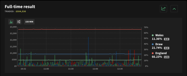
This allows a user to see how the odds have changed over a period of time – this is shown on the horizontal axis with the data shown by the lines. In the above example, we can see that England's perceived chance of victory (the red horizontal line) has stayed pretty stable that morning.
The graph also displays the amounts of money traded at specific times. This is shown on the vertical axis using vertical blocks. In our example, the biggest single trade was placed on draw (blue vertical block) between 11.30am and midday.
The three buttons above the graph allow a user to change specifics of the chart. For example, you can show the odds changes over a different time period or track a different number of selections.
Andy Schooler
29 November 2022